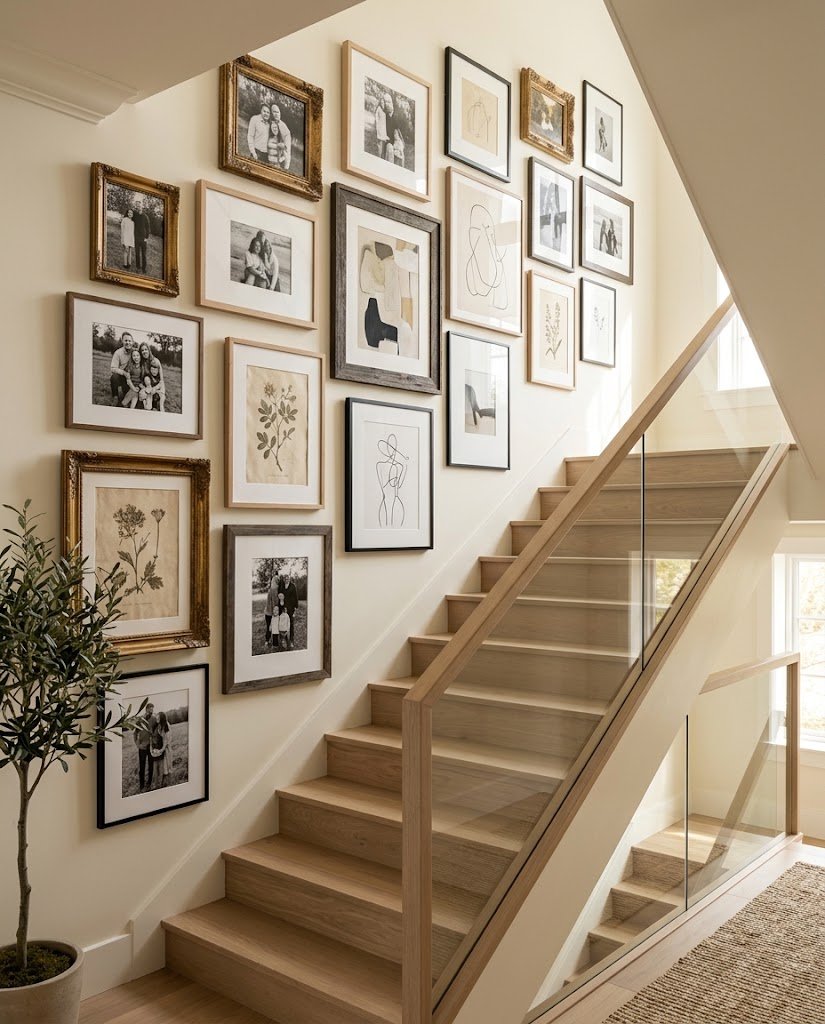
A staircase can be one of the most overlooked areas in a home. You walk through it every day, guests pass through it constantly, and yet that long stretch of wall often remains completely empty. That is exactly why a staircase gallery wall can have such a dramatic effect. Instead of treating the stairwell as a difficult decorating problem, you can turn it into a visual story filled with photographs, artwork, memories, and objects that actually mean something to you. Designers frequently point to staircases as an ideal location for gallery displays because the architecture already creates movement and gives the eye a natural direction to follow.
The best staircase gallery walls do not necessarily look expensive or overly styled. In fact, the most memorable ones often feel collected rather than purchased all at once. A wedding photograph might sit beside a vintage botanical print, a child’s drawing, an old postcard, or a small mirror. That combination gives the wall personality. Think of the staircase as a blank chapter in your home’s story: every frame adds another sentence, while the entire arrangement becomes a visual narrative that changes slightly every time you walk past it.
Why Staircase Gallery Walls Work So Well
The staircase has something an ordinary wall does not: built-in movement. The stairs rise diagonally, naturally encouraging your eyes to travel from one level of the home to another. When the artwork respects that architectural direction, the display can feel like part of the house rather than decorations that were simply attached to an empty wall. Current design guidance consistently recommends working with the staircase’s diagonal rather than fighting it with an unrelated horizontal arrangement.
There is also an emotional advantage. A staircase is a transitional space, so it is perfect for things you want people to discover as they move through your home. Instead of placing every favorite photograph in the living room, you can spread memories throughout the staircase and make the journey upstairs more interesting. The result can feel intimate without taking over a room. It is a little like turning an everyday hallway into a private museum where the exhibits happen to be pieces of your own life.
| Design Element | What It Adds | Best For |
|---|---|---|
| Family photographs | Warmth and memories | Traditional or family homes |
| Black-and-white prints | Timeless sophistication | Modern and transitional interiors |
| Vintage frames | Character and history | Eclectic and cottage styles |
| Botanical artwork | Calm, natural texture | Neutral and nature-inspired homes |
| Travel photographs | Personality and storytelling | Adventurous, collected interiors |
| Mixed artwork | Creativity and visual interest | Eclectic spaces |
| Matching frames | Order and polish | Minimal or contemporary homes |
| Picture ledges | Flexibility | Renters and changing displays |
The Staircase as a Natural Visual Path
One of the biggest mistakes people make is trying to decorate a staircase exactly like a flat living-room wall. On a level wall, you can create a horizontal row because the viewer normally stands on the same floor plane. A staircase changes the rules. Your viewing position changes with every step, and the architecture itself rises underneath the display. That is why a gallery wall that follows the staircase’s pitch usually feels more harmonious than one that stays perfectly horizontal.
The important distinction is that the frames themselves should generally remain level. You are following the angle with the arrangement, not necessarily rotating every picture diagonally. A recent staircase gallery planning guide makes the same distinction: the line connecting the frame centers follows the stair pitch while individual frames remain level. This small detail can make the difference between a display that feels professionally planned and one that looks as though the frames are sliding uphill.
1. Create a Family Story Gallery
A family gallery is probably the most personal direction you can take. Instead of choosing photographs simply because everyone looks good in them, select images that actually tell a story. Childhood photographs, wedding memories, grandparents, vacations, birthdays, pets, celebrations, and quiet everyday moments can all work beautifully together. The staircase becomes a timeline that your family encounters naturally rather than a formal photo display that feels too precious.
You can make the arrangement chronological, beginning with older generations or childhood photographs at the lower section and moving toward newer memories as the gallery rises. You could also organize it around relationships rather than dates. One section might feature grandparents, another parents, and another children. There is no universal formula because the meaning is yours. The strongest family galleries are usually the ones where every image has a reason for being there.
Choose Photos With Meaning
Do not feel pressured to include every family photograph you have. More frames do not automatically create a better gallery. Choose images that make you stop for a second when you see them. A slightly imperfect photograph can be much more valuable than a technically perfect portrait if it captures a moment you genuinely remember.
For a cohesive appearance, consider converting photographs to black and white or giving them a consistent tonal treatment. You can then introduce variety through frame sizes and materials. Designers quoted by House Beautiful recommend grouping meaningful family photos while maintaining a consistent visual palette, which helps sentimental images feel curated rather than chaotic.
2. Try a Clean Black-and-White Gallery
A black-and-white staircase gallery is ideal if you love personal photographs but do not want a colorful wall competing with your interior. The monochrome treatment gives different photographs a common visual language. A beach photograph, wedding image, childhood portrait, and architectural photograph can suddenly look as though they belong to the same collection.
Black frames with white mats create a particularly crisp effect, while natural wood frames make the same monochrome photographs feel warmer. You can also vary the orientation: use several vertical portraits alongside horizontal landscape images. The trick is not to make every photograph identical. Instead, let the color palette provide consistency while the image sizes and subjects create movement.
This approach works especially well in homes with neutral walls, wood floors, simple stair railings, or contemporary furniture. It can also be surprisingly timeless. When trends change elsewhere in your home, black-and-white photographs tend to remain visually adaptable, which means your staircase gallery can evolve without requiring a complete redesign.
3. Mix Art, Photos, and Personal Objects
If a wall containing only family photos feels too predictable, mix photographs with artwork. This is where a staircase gallery can become genuinely interesting. Pair a family portrait with an abstract print, place a small vintage landscape next to a travel photograph, or introduce a decorative mirror among the frames.
The Spruce’s gallery-wall guidance highlights mixed displays that combine photographs, artwork, mirrors, textiles, and decorative objects, showing how a gallery can become more than a collection of framed pictures. The goal is to create visual conversation between the pieces. One artwork might repeat a color from a photograph, while a wooden frame might echo the staircase railing.
Keep One Element Consistent
Mixing everything does not mean abandoning structure. Choose at least one connecting feature. It could be a shared frame color, similar matting, a limited color palette, or a recurring subject such as nature or travel.
This is the secret behind an eclectic gallery that looks collected instead of cluttered. You want variety, but you also want the viewer to sense that every object belongs to the same story. Imagine getting dressed with different textures and patterns while keeping one color repeated throughout the outfit. The individual pieces can be different, but the overall appearance still feels intentional.
4. Follow the Staircase Angle
The most dependable layout for a staircase gallery is the ascending diagonal. Instead of placing frames at one horizontal height, arrange their centers along a line that visually follows the staircase. This allows the gallery to work with the architecture rather than against it. Several current guides recommend this approach because the diagonal creates continuity between the artwork and the stairs themselves.
Do not interpret this as meaning every frame should touch the imaginary line. Larger frames may extend above and below it, and an organic arrangement can have plenty of personality. What matters is that the overall visual flow is climbing in the same direction as the staircase. Once that underlying rhythm is established, you can experiment more freely with frame sizes and artwork.
The Centerline Trick
Before putting holes in the wall, create a temporary centerline. Painter’s tape can be used to mark a guide that follows the stair angle, while paper templates can help you test frame positions. This planning method is repeatedly recommended in staircase gallery tutorials because it lets you see the composition before committing to nails.
A particularly useful approach is to measure the relationship between stair rise and run rather than guessing the angle. Your own staircase determines the correct pitch, so copying a generic diagonal from another house can gradually drift away from the architecture.
5. Build a Vintage Eclectic Gallery
For a home with character, vintage frames can make a staircase wall feel as though it has evolved over generations. Look for aged wood, brass, ornate gold, thin black metal, or painted frames at thrift shops and antique markets. They do not need to match perfectly. In fact, slight differences can make the display feel more authentic.
The key is to balance the differences. If every frame has an elaborate design and every artwork has a different color, the staircase may start feeling visually noisy. Try combining several simpler frames with one or two statement pieces. You can also repeat one finish two or three times to create subtle rhythm.
A vintage gallery works particularly well with old botanical illustrations, architectural sketches, family portraits, handwritten notes, maps, and black-and-white photography. The beauty is that you do not need everything to look new. Small imperfections can actually contribute to the story.
6. Use Matching Frames for a Polished Look
Matching frames are the opposite approach, and they are perfect when your decorating style is clean and organized. Six or eight frames in the same finish can create a strong architectural statement while still allowing the artwork inside each frame to be different.
Black frames are particularly versatile because they create a defined outline around photographs and prints. White frames can feel lighter, while natural wood brings softness to a neutral staircase. If your staircase already has strong architectural details, matching frames can prevent the wall from becoming visually overwhelming.
You can still vary the photographs or artwork while maintaining identical frame dimensions. Alternatively, use several frame sizes from the same collection. This gives you the polished appearance of a coordinated set without making the display feel completely repetitive.
7. Design a Minimal Staircase Gallery
Minimalism does not mean leaving the staircase empty. It means choosing fewer pieces and giving each one enough visual breathing room. A narrow staircase, in particular, can benefit from a restrained arrangement because too many large frames can make the passage feel crowded.
Choose three to five strong pieces rather than filling every available inch. A large abstract artwork might become the anchor, with smaller photographs accompanying it. Keep the frame style simple and let negative space become part of the design.
A minimalist gallery can also make a small home feel more sophisticated because the wall does not compete with the stairway itself. The eye can move naturally from one piece to another without being bombarded by dozens of details. Think quiet confidence rather than maximum decoration.
8. Turn the Landing Into a Focal Point
If your staircase has a landing, do not automatically continue the same arrangement across every wall. The landing can act as a visual destination. You might create an ascending line along the stairs and then use a more traditional gallery cluster on the landing wall.
This creates two different experiences within one display. The staircase guides the eye upward, while the landing provides a place where the viewer can pause and examine a larger collection. Current staircase design examples specifically recommend combining a cluster at a landing with a line along the climb when there is enough wall space.
A large statement piece can work particularly well here. Consider a family portrait, oversized landscape, large abstract painting, or vintage mirror. Because the viewer naturally arrives at the landing, the focal piece feels like a reward at the end of the visual journey.
9. Add Botanical and Nature-Inspired Artwork
Botanical prints are a wonderful choice when you want a staircase gallery to feel calm and sophisticated. Ferns, leaves, flowers, pressed-botanical reproductions, landscapes, and nature photography introduce organic shapes that contrast beautifully with the straight lines of stairs and frames.
For a softer appearance, use natural wood frames and warm neutral mats. For a more contemporary look, pair botanical prints with slim black frames. You can also mix real pressed leaves or dried botanical specimens into shadow boxes for additional texture.
Nature-inspired galleries are especially useful when the rest of your home already contains natural materials such as wood, linen, rattan, stone, or woven fabrics. Repeating those organic themes across the staircase creates continuity without requiring every room to match.
10. Create a Travel Memory Wall
Your staircase can become a passport without leaving the house. Choose photographs from meaningful destinations and combine them with maps, tickets, postcards, small sketches, or artwork inspired by places you have visited.
Instead of simply arranging everything by date, consider creating a visual journey. Perhaps coastal photographs appear toward the bottom, city scenes occupy the middle, and mountain landscapes lead toward the upper floor. Alternatively, arrange the images chronologically so the wall becomes a record of how your travels have evolved.
The advantage of a travel gallery is that it naturally creates conversation. Guests often ask about photographs from unfamiliar places, which means the wall becomes more than decoration. It becomes a collection of stories you can share.
11. Experiment With Different Frame Sizes
A staircase gallery does not have to consist of identical rectangles. Mixing sizes can create rhythm and make the display feel more collected. The important thing is to avoid randomness without structure.
One dependable strategy is to use one or two larger anchor frames surrounded by smaller pieces. Another is to alternate between portrait and landscape orientations. If you are working with a larger staircase, you can also create a denser salon-style cluster while maintaining the overall diagonal movement.
Current gallery-wall guidance recommends mixing frame sizes and orientations while maintaining consistent spacing and an overarching visual relationship. The staircase gives you plenty of room to experiment, but remember that the composition should still have a visual center. If everything is equally large and equally dramatic, nothing feels special.
12. Use Picture Ledges for Flexible Styling
Picture ledges are an excellent alternative if you enjoy changing your décor. Instead of drilling individual holes for every frame, you can lean artwork against the ledge and rearrange it whenever inspiration strikes.
This is especially useful for renters, families, or anyone whose taste changes frequently. You can layer large frames behind smaller ones, add a few books, display small objects, or rotate seasonal artwork. Some contemporary staircase ideas recommend using ledges parallel to the stair angle to reinforce the architecture.
The only caution is safety. Staircases are high-traffic areas, so anything placed on a ledge must be secure and positioned where it cannot fall into the walking path. Avoid heavy or unstable decorative objects, particularly if children or pets regularly use the stairs.
13. Make a Narrow Staircase Feel More Open
A narrow staircase requires restraint. The temptation is to fill the large wall because it feels empty, but too many bulky frames can make the passage feel even tighter.
Use slimmer frames, lighter mats, and a controlled arrangement. White space around individual pieces can help the wall breathe. You might also use a single vertical line of smaller frames rather than a dense cluster.
For a narrow staircase, the arrangement should feel like a visual ribbon running upward. Current guidance for narrow staircases similarly emphasizes respecting the walking path and using a clean diagonal centerline rather than overcrowding the wall.
14. Choose the Right Spacing and Height
Spacing is one of those details you notice immediately when it is wrong, even if you cannot explain why. Frames that are too far apart can look disconnected, while frames pushed tightly together can feel chaotic.
Many gallery-wall guides suggest keeping gaps relatively consistent, with some staircase-specific recommendations around two to three inches between frames. Your actual spacing can vary depending on frame size, wall width, and overall style, but consistency is the important part.
Height also changes on a staircase. Instead of measuring every frame from the floor as though the floor were level, relate the artwork to the stair or to a diagonal guide. Some guides recommend keeping frame centers at a comparable visual height above the stair nosing while following the staircase’s pitch.
A Practical Staircase Gallery Wall Formula
A simple planning method is to measure your staircase’s rise and run, establish a diagonal guide, and then place the centers of your frames along that visual path. Keep individual frames level, leave consistent gaps, and make sure the lowest pieces do not interfere with the handrail or walking area.
Mixtiles recommends keeping the lowest frames several inches above the stair nosing and leaving adequate room around handrails, while other guides emphasize testing the arrangement with paper templates before hanging anything permanently.
| Planning Step | Recommended Approach |
|---|---|
| Measure staircase | Record rise and run |
| Establish direction | Follow the actual stair pitch |
| Frame orientation | Keep individual frames level |
| Spacing | Aim for consistent visual gaps |
| Lowest artwork | Keep clear of steps and handrail |
| Large pieces | Use as visual anchors |
| Templates | Test positions before drilling |
| Final check | View from both bottom and top |
15. Choose Colors That Connect the Home
Your staircase gallery does not have to match every piece of furniture in the house. However, a small color relationship can make the display feel connected to its surroundings.
Look around the staircase. Maybe your home has warm oak flooring, cream walls, olive cushions, or black metal lighting. You could repeat one or two of those colors in your artwork or frames. This creates cohesion without making the gallery look like a furniture showroom.
Interior designer Kathy Kuo, quoted by Homes & Gardens, recommends having an overarching color scheme while recognizing that staircase gallery walls offer freedom to experiment because they are not necessarily competing directly with furniture. That balance is worth remembering: coordinate, but do not over-coordinate.
16. Avoid Common Staircase Gallery Wall Mistakes
The first mistake is rushing straight to the hammer. Staircase walls are difficult to correct because every hole can remain visible, especially when the gallery is viewed from several angles. Build the composition on the floor first, then use paper templates or painter’s tape on the wall.
Another common mistake is creating a literal staircase shape with the frames. In other words, each frame is shifted upward and sideways in little steps. While that sounds logical, it can look awkward because the actual staircase already provides that stepped geometry. A smoother diagonal line tends to feel more intentional.
You should also avoid placing artwork too close to the handrail or walking path. The staircase is a functional space, not merely a decorative wall. Finally, do not choose artwork solely because it matches your color palette. A perfectly coordinated collection with no emotional or visual interest can feel much less personal than a slightly imperfect collection filled with things you genuinely love.
How to Plan and Hang Your Gallery Wall
Start by photographing the staircase from both the bottom and top. These two viewpoints reveal problems that may not be obvious when you are standing directly in front of the wall. Then measure the available wall area and note the position of the handrail, corners, doors, switches, and other architectural details.
Next, choose your artwork and place everything on the floor. Begin with your largest piece or strongest visual anchor, then build around it. If you prefer a more structured design, use matching frames and regular spacing. If you want an eclectic appearance, mix sizes and materials while keeping one or two connecting elements.
Create paper templates for each frame and attach them to the wall using painter’s tape. Step back frequently. Look from the bottom, middle, and top of the staircase. This is where you will discover whether a frame feels too low, whether the gallery is drifting away from the stair angle, or whether one side looks heavier than the other.
Only after you are satisfied should you mark the hanging hardware. Current DIY guidance specifically recommends using templates and testing the arrangement before committing to the wall. If possible, have another person help you when positioning larger frames on a staircase. Once everything is installed, check that each frame is secure and level.
The final step is not necessarily the end. A great gallery wall can evolve. Add a new family photograph after a special occasion, replace an artwork when your taste changes, or introduce a small vintage piece you discover later. The goal is not to create a wall that looks frozen in time. The goal is to create one that feels as though it belongs to the people who live there.
Conclusion
A staircase gallery wall can completely change the personality of an otherwise overlooked part of your home. The secret is not buying the most expensive frames or filling every inch of wall space. It is creating a relationship between your staircase, your artwork, and your personal story.
Follow the architecture, experiment with frame sizes, maintain enough consistency to create rhythm, and choose pieces that actually mean something to you. Whether you prefer a polished black-and-white arrangement, a vintage collection, a family timeline, a botanical display, or a colorful travel gallery, there is no single correct formula.
The most beautiful staircase gallery walls often have one thing in common: they feel lived in. They look curated, but not sterile; personal, but not chaotic. When someone walks upstairs and pauses to look at a photograph, recognize a place, or ask about an unusual piece of art, the wall has done more than decorate your home. It has started telling its story.
FAQs
1. What is the best layout for a staircase gallery wall?
The ascending diagonal is one of the safest and most visually harmonious layouts because it follows the staircase’s natural direction. Keep the individual frames level while allowing the overall arrangement to rise with the stairs.
2. Should pictures on a staircase be tilted?
Generally, no. The individual frames usually look better when they remain level, while the line connecting their centers follows the staircase angle. Rotating every frame can make the artwork appear unstable and compete with other horizontal architectural elements.
3. How much space should I leave between gallery wall frames?
A consistent gap is more important than following one universal measurement. Several staircase-specific guides suggest roughly two to three inches between frames, although larger arrangements may need more breathing room.
4. Can I mix different frame colors on a staircase gallery wall?
Absolutely. Mixed frames can create a beautiful collected appearance. To keep the arrangement intentional, repeat another element such as mat color, artwork palette, frame material, or subject matter.
5. What should I put on a staircase gallery wall besides family photos?
Try botanical prints, travel photographs, abstract artwork, vintage maps, children’s artwork, mirrors, textiles, architectural sketches, postcards, or small decorative objects. A combination of personal and artistic pieces can make the wall feel much more curated than a collection containing only one type of image.